Theories and trends involving workplace design have been chaotic in recent years and the commercial interiors industry (both designers and manufacturers) is constantly scrambling to come up with the next hot ticket item or concept. Dealing with mobile technologies, millennial life styles, collaboration spaces, residentialization (is that a word?), wellness, unassigned desking etc. the list of trends and their associated challenges is long. In the end, “cool offices” get celebrated for their breakthrough designs, the new amenities they offer employees, and the way they make for fantastic photography.
Beneath this creative office design resolution are some real challenges to managing the way these cool offices are impacted (or perhaps restricted) by real-world technology. One of these challenges presents itself when conferencing technology meets interior design and furniture specification, particularly in huddle rooms or huddle spaces. There’s absolutely a need for creating huddle spaces within the office that promote casual interactions, but serious project meetings rely on technology to communicate ideas, activities and goals.
A huddle space can be a banquette in the cafeteria or a custom designed nook as seen in practically every photo shoot of the latest cool office. Rarely shown in these photo shoots is the huddle room with thousands of dollars’ worth of state of the art teleconferencing and computer equipment. These are the closed door huddle rooms, where 4-6 people (or more) bridge into offices overseas, or across town, or even on a different floor in the same building. In these rooms, the meeting topics are about how to bring the good ideas from (perhaps initiated in the banquette on the magazine cover) to the marketplace before somebody else. These are not casual meetings, these are “get it done meetings,” and all the mobile technology and indoor bleachers in the world cannot replace the value of having the stakeholders together in a secure and functioning technology environment to present and argue the solutions that will get the job done. Bad connections, echoes, startup delays, security risks, and broken technologies are therefore not tolerated.
For the past year Innovant has been providing a CEU course to designers that focuses on how to avoid some of the pitfalls that can arise when a client chooses to deploy several such huddle rooms across a new campus or headquarters. The basis of our intel and experience came predominantly from our large Silicon Valley clients, one of which has deployed over 2500 technology based huddle rooms in the past 3 years. Not all clients will have such a need, but the suggestions here can apply to everyone.
Suggestion #1: Avoid the built in “Picasso”
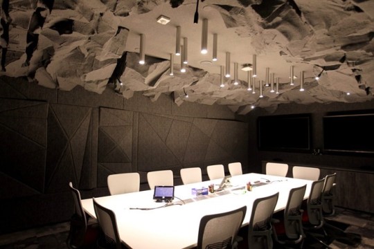
The early days of huddle room design, especially at Google, saw many huddle rooms custom designed with displays built into walls and technology cabling routed through walls and floors. More effort was put into the artistic expression of the room than in enabling the room to evolve over time. While this makes for a great vanity shot, the technology in these rooms is usually antiquated within a year, and replacing built in technology can be costly and time consuming.

Suggestion #2: Keep it “Technology Agnostic”
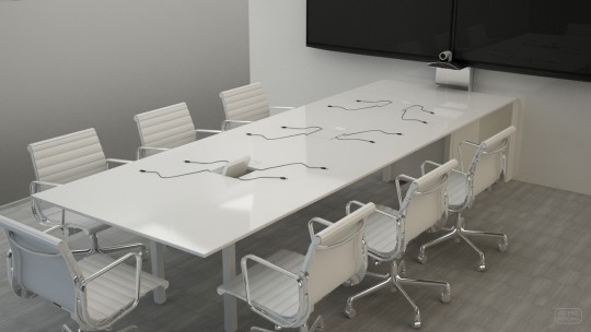
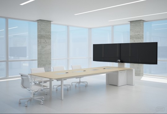
Without providing any design direction here, the point is to consider furniture and room features that do not impede the ability to quickly and effortlessly upgrade technology. Sophisticated huddle tables and display mounts are available that provide this capability without impacting aesthetics and design. Technology companies are rapidly developing new and better conference technology that end users will inevitably purchase and need to install without significant disruption and delay. There are a number of “all-in-one” technology packages that provide displays, processing power, cameras, microphones and other features, but they are often very expensive up front and limit the ability to upgrade features in the future.
Suggestion #3: Be wary of cabling distances
Huddle / conference room technology, like almost everything else, is using USB cabling for many of the devices needed to make it work (cameras, microphones, etc.) What needs to be understood is that there are maximum distances that USB based technology can span. Less than 16’ for USB 2.0 and less than 10’ for USB 3.0. Without careful consideration of how these devices will be positioned in the room in relation to the technology that’s driving them, problems can quickly arise. It doesn’t take too many turns through the furniture, floor and walls to quickly pass these distances, so how the furniture bridges devices and technology is an important consideration.

Suggestion #4: Keep it freestanding
Most huddle rooms these days utilize furniture products that contain all of the huddle room technology, including the displays, cabling, power and processing. Innovant’s FORm_AV suite has over 50 different sizes and shapes of huddle tables, each with optional features that can support PCs, codecs, microphones, cameras, and displays. This makes installs, upgrades and relocation super-fast, easy and inexpensive so clients can feel confident that their huddle rooms will never get out of date.

Suggestion #5: Location, Location, Location
When company executives invest in technology based huddle rooms, they expect to see them in use. Walking past a row of empty (expensive) huddle rooms tucked in the far corner of an office will lead to questions of competency in space planning. The easiest way to make them popular is to make them extremely visible. Locate huddle rooms next to high traffic areas to remind people of the tools they have at their disposal and to see others using them effectively. Bloomberg, a heavy user of huddle rooms even has glass enclosed huddle rooms right in the entry way of their NYC headquarters, visible to employees and guests alike.
